The existing main menu for the backoffice of MyOnlineStore became outdated and cluttered. A lot of features were added over the years without a clear information architecture. It was time to create the long needed structure and give the design an update at the same time.
⚙️ Initial setup
The existing main menu for the backoffice of MyOnlineStore became outdated and cluttered. A lot of features were added over the years without a clear information architecture. The frustration and confusion were clearly visible in screen recordings and user tests. It was time to create the long needed structure and give the design an update at the same time. I took it upon myself to research, design and fix it within 2.5 months.
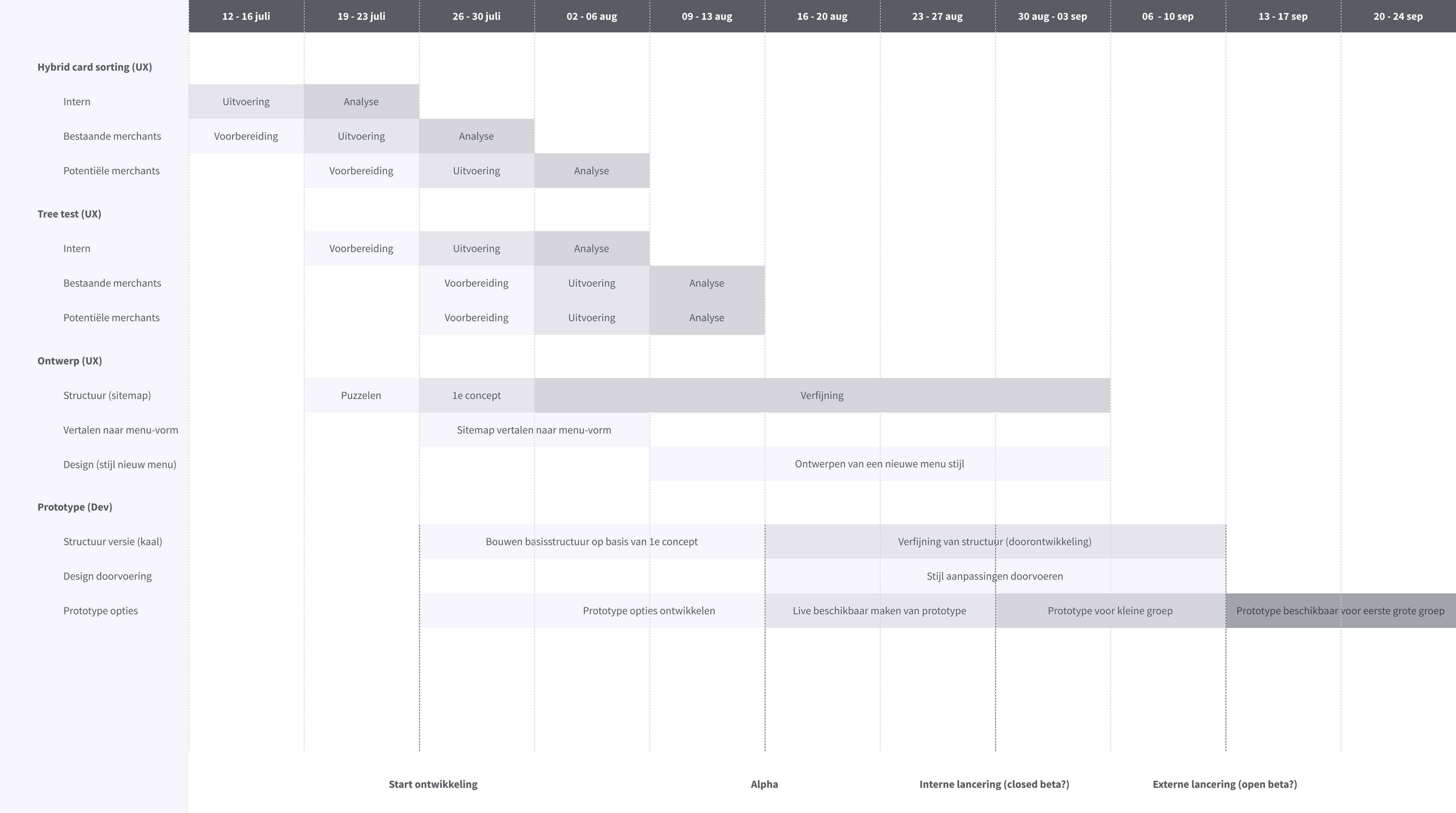
To get to a point of a stable release I began with some desk research into the subject and provided a battle plan for the team. The outlines of the plan were as follows:
- 🗂️ Categorising (Hybrid card sorting - 4 weeks)
- 🌳 Structuring (Tree test - 4 weeks)
- 🎨 Designing (Wireframe & UI- 7 weeks)
- 🧪 Testing (Prototype + Beta - 9 weeks)
- 🚀 Launch (Live)
🗂️ Categorising
As a preliminary test I ran moderated hybrid card sorting sessions with 12 users of the platform and 8 potential users. The test contained cards for (most of) the items in the existing menu structure (44) and asked the participants to sort them into categories. Several pre-defined categories were given as a starting point with the freedom to add their own categories or rename the existing ones.
This resulted in a significant set of 8 categories for the main menu, with a decent picture of the cards that were frequently placed together (at least 70% of the time), and thus probably should be in the same menu section. Since the participants were able to name the categories, this gave me a pretty decent starting point for the next test...

🌳 Structuring
With the results of the hybrid card sorting session I was able to create a concept sitemap for a tree test. This sitemap was a bit more extensive than the 8 categories found in the card sorting sessions. I decided to split one of the 8 categories (settings) into smaller sub-categories of settings. This resulted in a main level and a settings-level for the menu. To test this sitemap I ran a tree test. The sitemap for the tree test contained 6 items on the main level and 6 items on the settings-level containing a total of 49 pages.
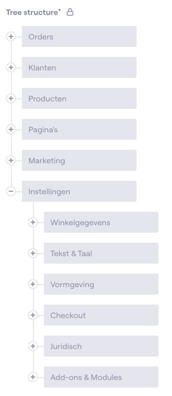
I used this sitemap to run an unmoderated tree test with 90 participants in Maze. The participants were tasked with finding several pages in the sitemap and were asked about their perceived frequency of use for several menu items. This gave me insight into the logic and usability of the menu structure and a solid idea of how much attention to gave the menu items based on the frequency of use. Items that were perceived as daily use, should at least be on the top level.
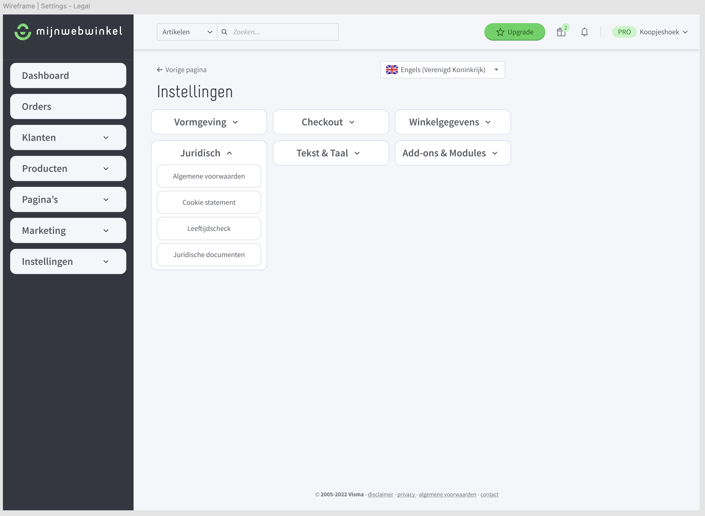
🎨 Designing
The tested categories and structure provided a good foundation to start with wireframing and preliminary design exploration. After a little bit of puzzling I landed on a wireframe that provided a direct overview of daily use items and a separate section for all 'low frequency' use settings. For example: The available shipping options won't change every day, but you do want to view your orders every day.
Wireframe
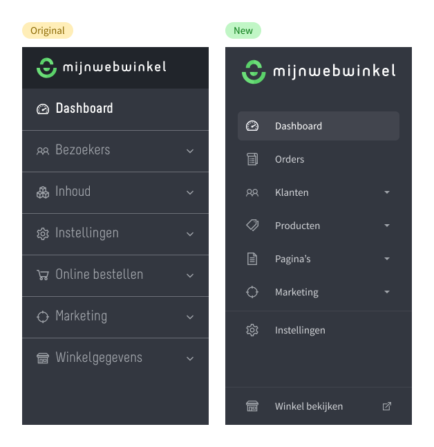
Design
In a separate puzzle I started with design exploration. At the time one of the main issues with the original design was that it felt quite clutterd, unclear and frankly massively outdated. After trying out several options I landed on a new design. The new design had better spacing, more whitespace (less lines) and had a more modern feel to it. I even added a bonus button to access your store more easily. Choices made in this redesign would later become the foundation for a UI overhaul of the entire backoffice and corresponding design system.
Design comparison
Current state in Figma

🧪 Testing
Since a new menu would be a very big breaking change for a lot of our customer base I wanted to test the new menu gradually. During the designing I developed a prototype together with our frontend team to be used for testing. After several interviews with customers, and a few minor tweaks, we decided that we would make the new menu gradually available as a beta feature.
Phase 1
In the first phase: a group of 500 customers would get a pop-up at login, explaining the how and why of the new menu and how to toggle it off.
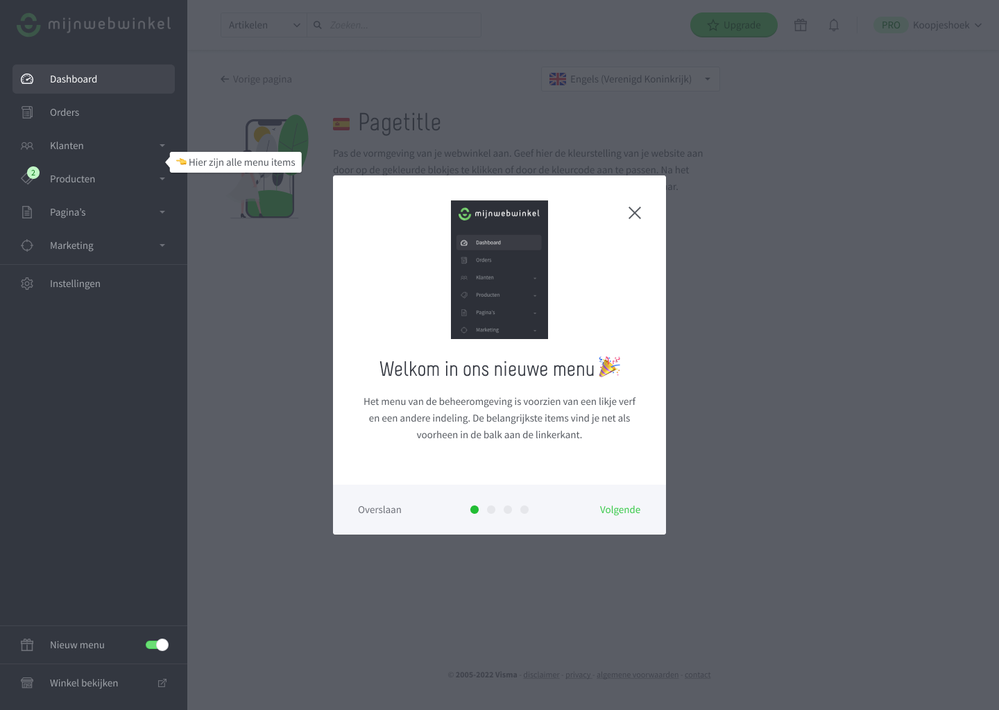
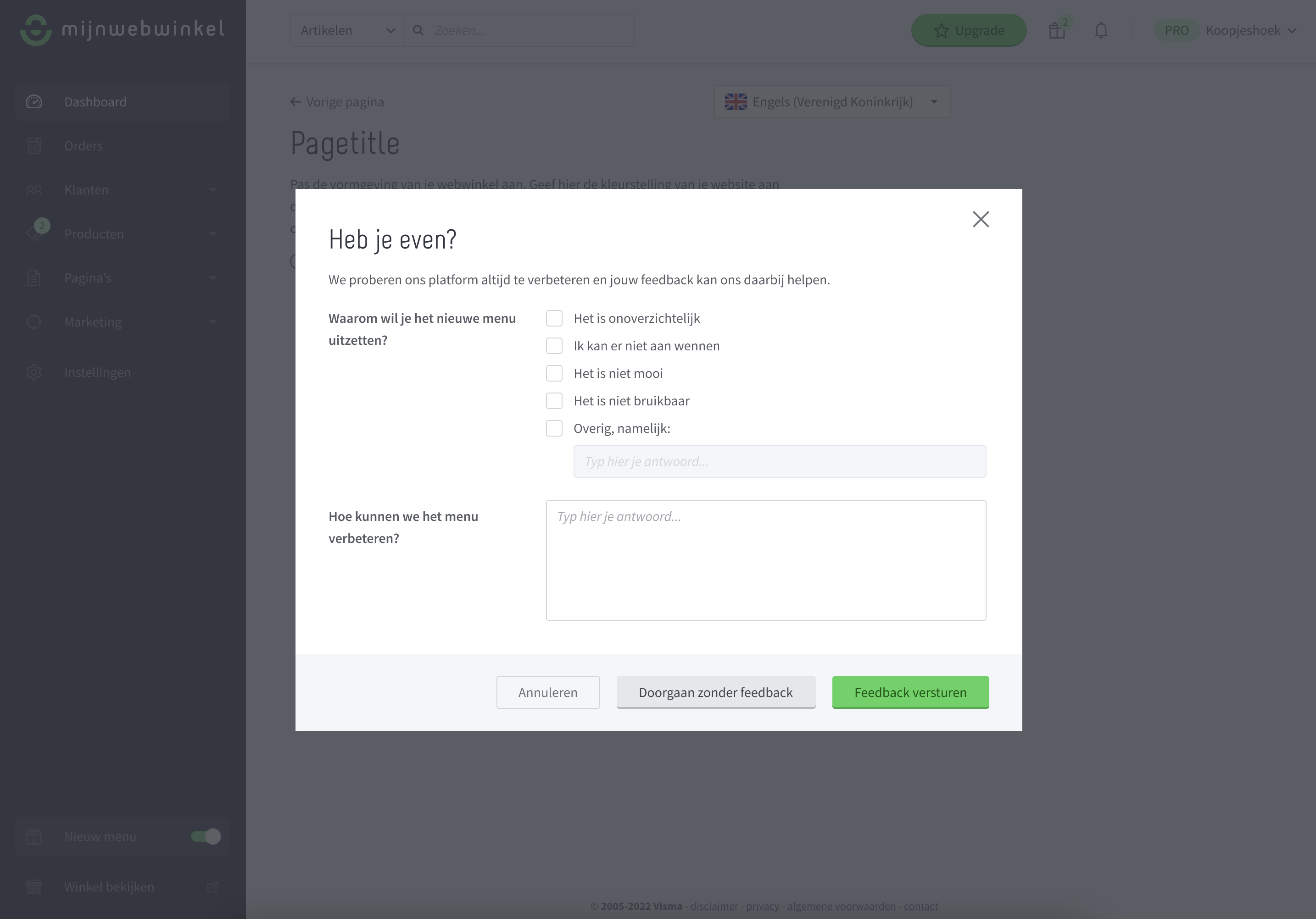
The first phase lasted several days. We measured the amount of times people toggled it off and asked them why they had toggled it off and how we might make it better/work for them in the future. This resulted in 7 people who toggled it off for reasons along the lines of: "I was so used to the old one". A great success.
Phase 2
In the second phase we pushed the new menu in the same way to the entire user base. This time a few hundred people turned it off, again for similar reasons. We let this phase run for about 1 month while our marketing department communicated the upcoming forced change to the new situation.
🚀 Launch
Eventually the new menu launched, receiving praises from a large number of our customers (even some who had toggled it off, but got used to the new situation after a week or two and eventually saw the benefits). The new menu was a fact. 🥳